Summary
In this educational project, I designed the Real-world Language Learning Flashcards for EU-inno. There are numerous apps for people to learn new languages, as a designer also a deep user, I found that all of those what I knew have two common problems. Firstly, the interfaces of the text-based educating apps do not conform to the brain’s memory mechanism, secondly, their built-in thesaurus cause users to learn lots of unwanted words. My goal was to create a cognitive and customizable vocabulary flashcard tool for practical language learning
Main Challenge
- Connect the learning tool to user’s real-world language scenario
Real-World Learning Experience
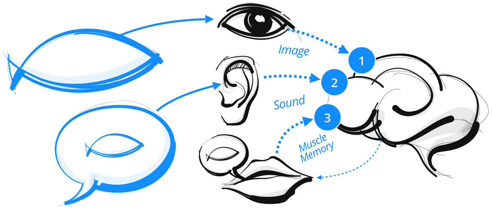
How people learn the word “FISH” in life
In order to design a language learning tool, I started by understanding the brain’s cognitive and memory mechanisms
1.SEE
See a fish, then the eyes pass the image to the brain
2.LISTEN
Hear someone call that thing “FISH”, then the ears pass the sound to the brain
3.REPEAT
Speak the word out, then the mouth muscle pass the experience to the brain
Language Learner Journey Map
New word
- Saw a new word in the menu while ordering
- Can’t understand a term in clients’s email
Learn
- Know the meaning of the new word from dictionary or from others
Recall
- Recall the meaning when encountering the words again
- Relearn if failed to recall
Use
- Say these words in conversations with colleagues
- Write these words in messages to friends

Insight 1
Find more intuitive elements to help the learner remember the word rather than just a piece of text definition
Insight 2
Create a way for the learner to review the word when he is about to forget
Insight 3
Help the learner make review schedule for words that have been learned but are not used often
Interfaces
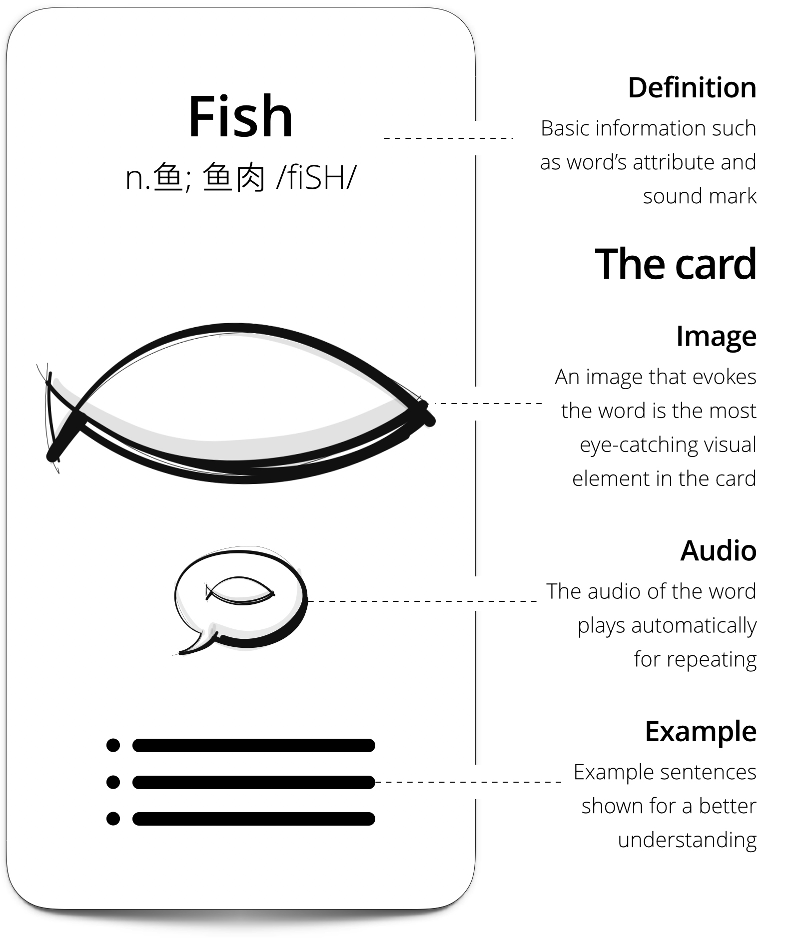
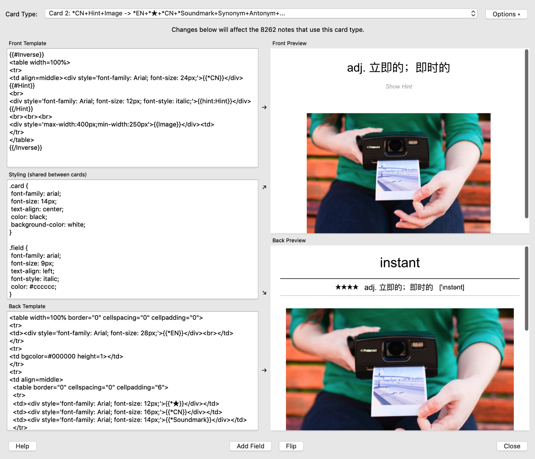
The flashcard’s basic layout
I designed and developed the flashcard based on Anki, an open-source spaced repetition platform using SuperMemo algorithm. I built the interfaces in HTML
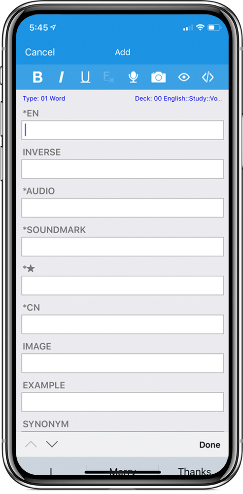
Create a card
Users can create a card when they meet new words that appear in life, such as vegetable names in grocery store or terms from working emails
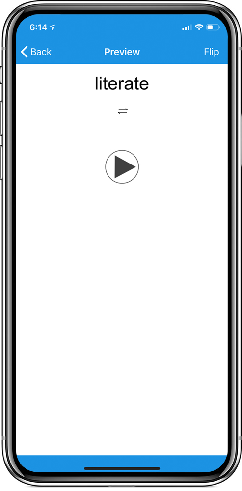
Show the question
On the card’s front side, a new word is displayed along with an automatically play of a native pronunciation audio
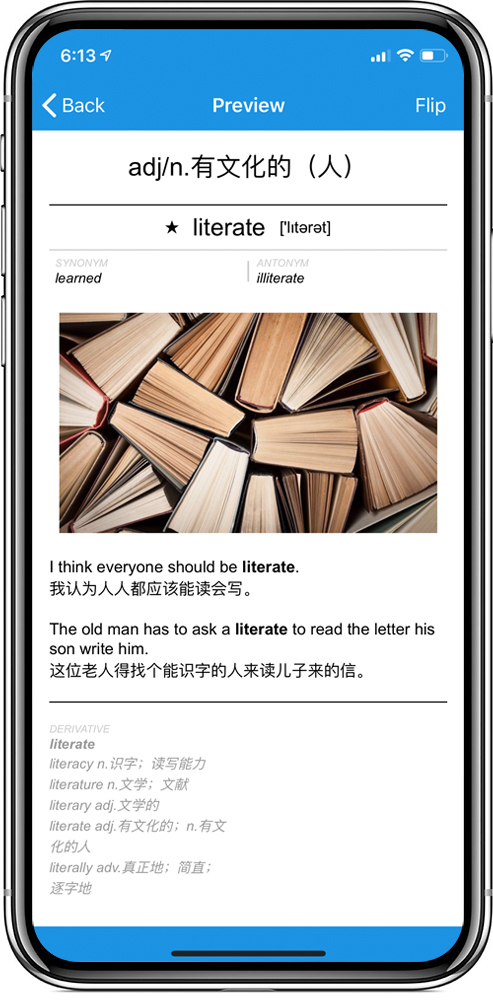
Show the answer
After thinking about the answer, touch the screen and the card’s backside will then be shown.
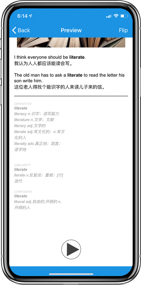
Supplementary info
Swipe down the card to see related information such as derivatives, similar words, and the ones that are easily confused with
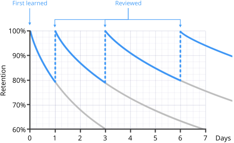
Forgetting curve
This curve shows how memory is lost over time when there is no attempt to retain it. At the default starting easiness, cards will be shown again approximately 2.5 times longer than the previous time, so if the user had waited 10 days to see the card previously, the next delay would be about 25 days.
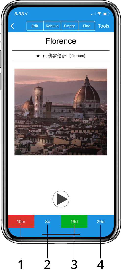
Rate the word’s memory level
Users should compare the answer they thought of with the answer which is shown and tell the app how well they remembered.
1.AGAIN
AGAIN marks the memory as incorrect and asks the app to show the card more frequently in the future.
2.HARD
HARD shows the card at a slightly longer delay than last time, and tells the app to show the card more frequently in the future.
3.GOOD
GOOD tells the app that the last delay was about right, and the card easiness doesn’t need to be adjusted down or up.
4.EASY
EASY tells the app the user found the delay too short. The card will be scheduled further into the future than GOOD.
Iteration for Long-Term Experience
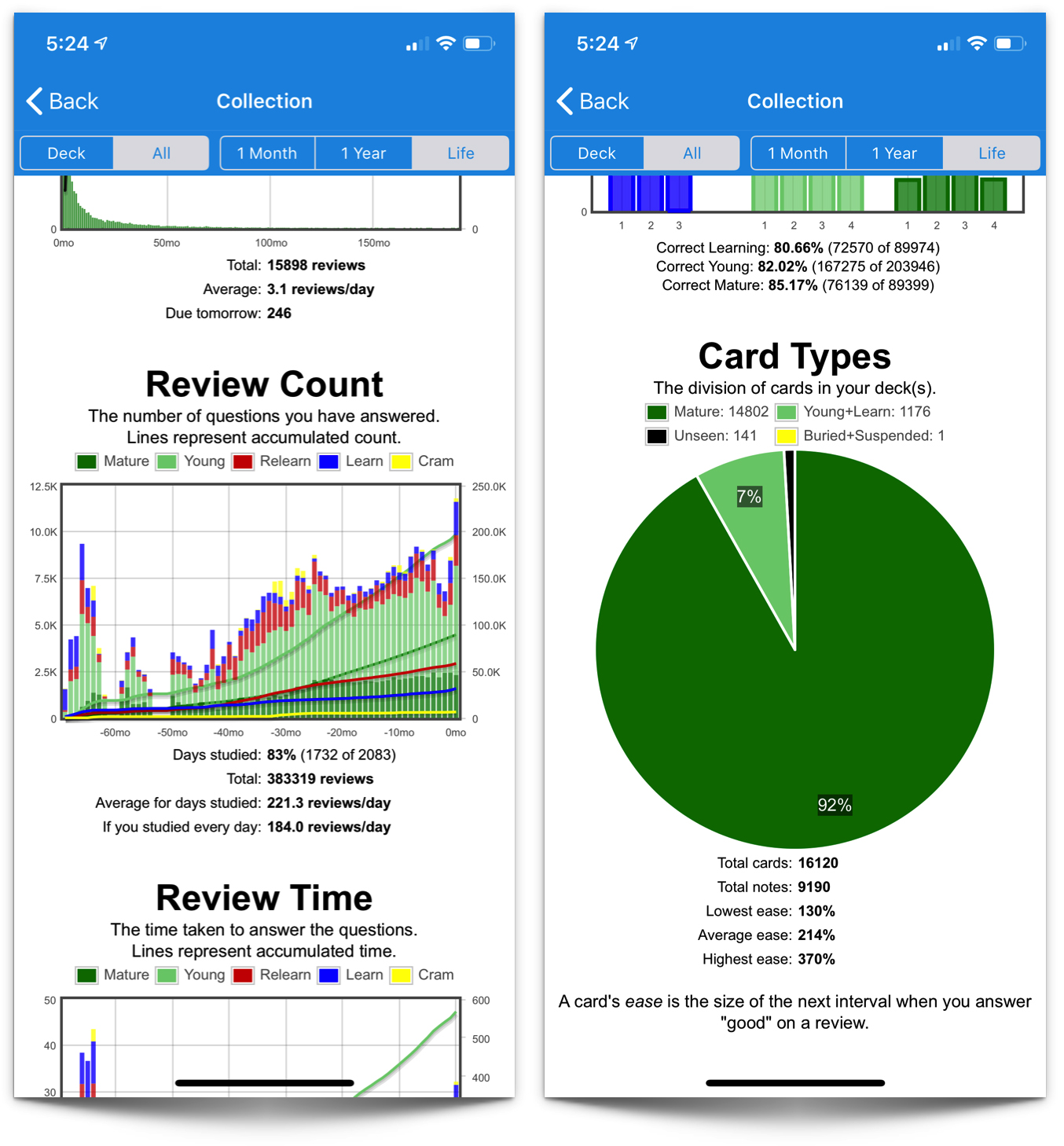
My usage statistics
- 6.5 years everyday usage
- Created 16,120 flashcards
- Review time: 1,046 hours
- Review count: 383,319 cards
Some problems can only be found after a long time of use
I have used the app for more than 6 years – even after I finished the project. I can always find new problems and have ideas to make it better. It made huge improvements for long-term user experience
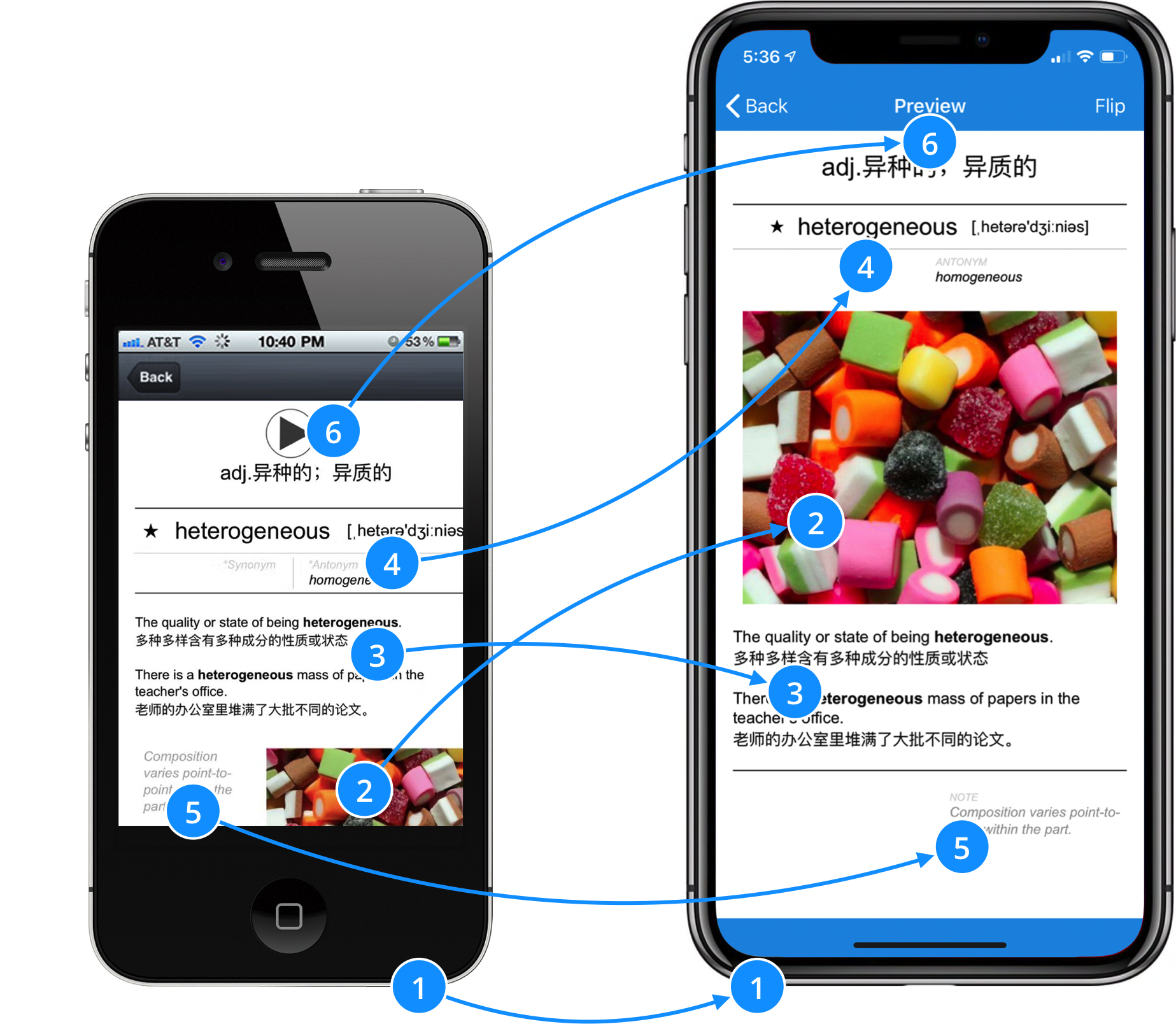
iPhone 4s, 2011
iPhone X, 2018
Originally designed for lower resolutions
Redesigned for newer cellphones
IMAGE wasn’t large enough to catch users attention
Increased the IMAGE to 85% screen width
EXAMPLE wasn’t the most frequently read content
Moved the EXAMPLE module under the IMAGE
Dividing lines in DEFINITION were too distracting
Simplified the dividing lines
NOTE should not be shown in the first screen
Moved down the NOTE and made it a smaller font size
The audio play key needed a better place
Moved audio play key to the bottom for more space


